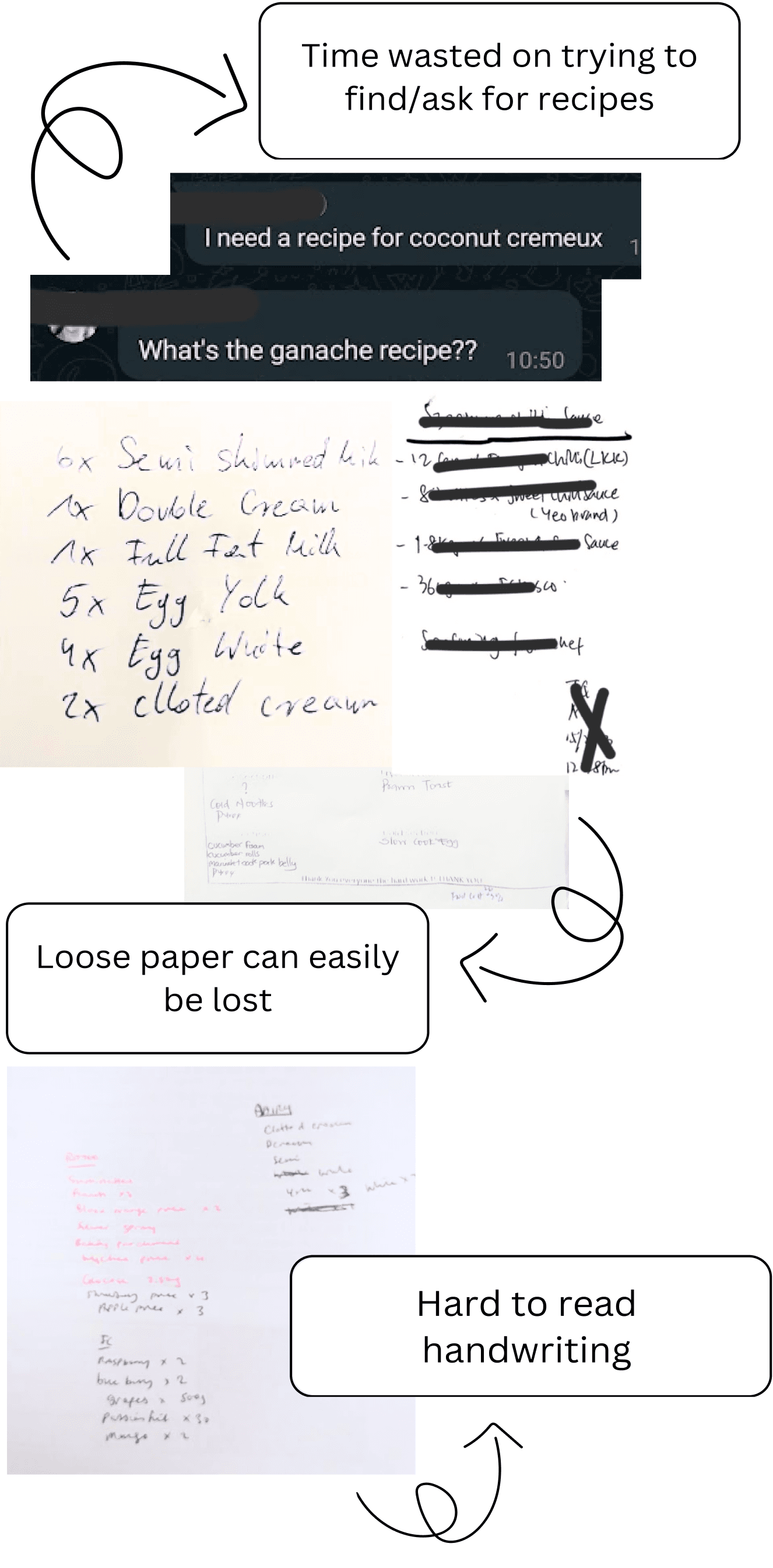
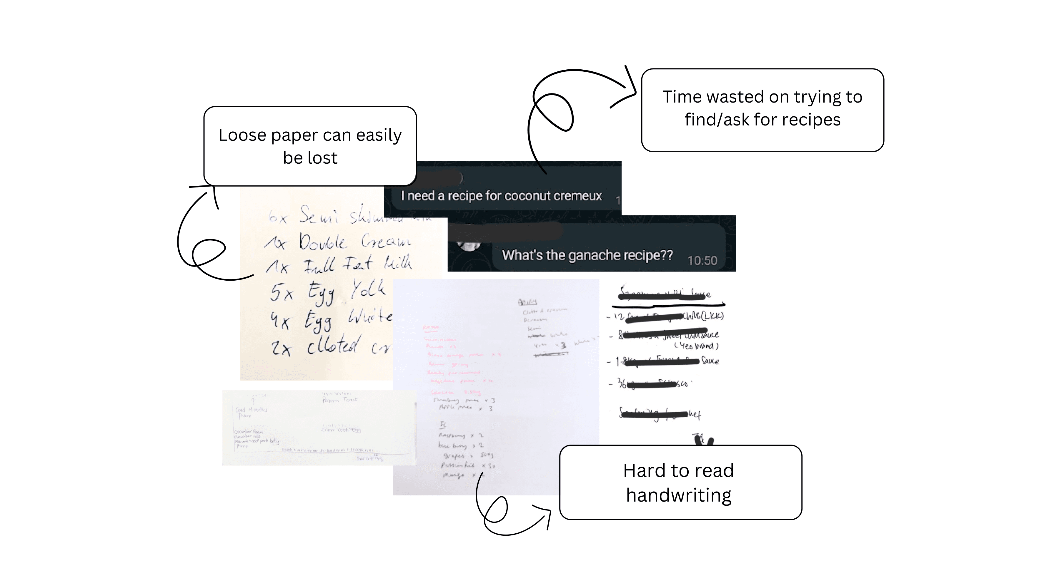
I’ve worked in many different kitchens during my decade as a chef and there was a common issue in every kitchen. Missing recipes, incomplete m.e.p lists and orders not made leading to inefficiency and chaos in the kitchen. "Mise en place" (m.e.p) is a French term used in culinary settings, meaning everything that needs to be done before cooking/service.
As a Product Designer this was a problem I wanted to solve the most. I set out to design an app that allows each section in the kitchen to organise their handovers and orders while having all the recipes in one place. Improving efficiency and saving time in the kitchen leading to improved restaurant business and customer satisfaction.
I lead the entire project from problem discovery to the final MVP. I worked on ideating a solution which would best fit a Chef's life, created the wireframes and prototypes and tested the solution with fellow chefs.
What are my tasks for today? Were the orders done? What’s the recipe for this?
Not having a m.e.p list, recipes missing, not having the ingredients you need etc are all common occurrences in a kitchen.
When I became a Head Chef, I realised why recipes were never updated, and why there wasn’t a proper m.e.p list in place.
It was just a hassle to have to update the folders. We have so much to do in the kitchen it made going down to the office to update things like the recipes feel like a bother. This is made even harder when most of our time is spent in the kitchen and not in front of a computer.
This was when I kept thinking, why isn’t there an easier, more convenient way to get this done?
Imagine getting into work early in the morning, you have no idea what your tasks for the day are or whether the orders were done.
With the M.E.P. app, you would be able to see your list of tasks before getting to work, giving you better mental preparation for the day. You can see that all the ingredients you need to complete your tasks have been ordered and the recipes you need to complete your tasks are all there on the app.
Working in a kitchen can be busy and chaotic, when you see something that needs to be ordered you normally just make a mental note till you have a pen and paper to write it down (But as we all know, human memory during busy times can be a little unreliable). However, this can be done instantly by quickly noting down the order in the M.E.P app. If you forget to put a task on the list for the next day, no problem, just add it while on the bus home.
Know exactly what you need to do for the day
Sense of achievement when clearing the list
Create next days tasks, anytime, anywhere
All the recipes you need on the app
No more wasting time looking for a recipe or waiting for a reply
Took the last packet of icing sugar? Mark it down to be ordered on the app straight away before you forget
The chef in charge of the orders can see what needs to be ordered from anywhere to ensure orders are made even when not at work
Going from a Commis Chef to Head Pastry Chef I’ve experienced both being the one trying to figure out what I need to do and telling others what to do. Some places had very organised recipes and in some places, I’ve had to google or just use my own.
I needed to understand how other chefs felt about the current system in their kitchens.
To do this, I conducted a user survey to gain insight into existing practices in other kitchens and different sections of a kitchen. I then proceed to conduct user interviews with 5 chefs of different positions.
Using the information provided by the survey and user interviews, I obtained user stories and created personas to represent the 2 main levels of chefs in the kitchen.
To make the app as convenient and easy to use as possible, I shadowed a few chefs during their work to come up with the most natural user flow for each task. Using the information I obtained I created a user journey map highlighting the issues that commonly occur and was able to identify the opportunities for my solution.
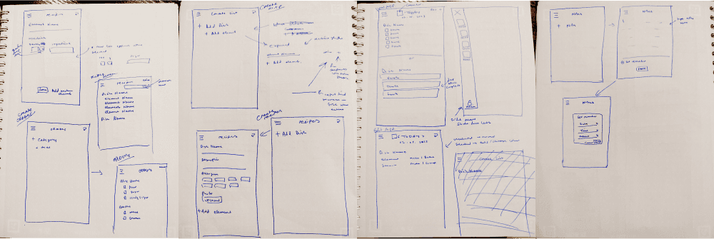
Since this is an app designed for chefs, I asked fellow chefs for their input and ideas for the design of the app. I gathered a few chefs during one of our breaks at work and together, we brainstormed features and functionalities for the app, drawing inspiration from our daily kitchen experiences.
These are the original sketches we came up with ready to be turned into wireframes.
It was important to make sure every step the user needed to take when performing the tasks was logical and easy to understand. After turning the sketches into wireframes I ran a usability test with my fellow chefs to identify anything I had missed when designing the flow.
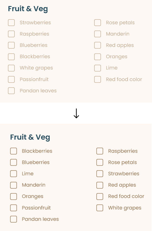
During the final usability testing of the prototype, it came to my attention that I had neglected the accessibility side of the app! I went back to ensure better contrast between text and background and increased the touch points of all the icons and checkboxes.
Being an MVP built in a mere 2 weeks, I’m not able to test whether the app was able to save the company any money through increasing staff organisation and efficiency or whether it increased the performance of the chefs. However, I am able to measure the following KPIs:
Task completion rate
Task completion time
Net promoter score
For the task completion rate, I had around 80% success rate with some of the older chefs less knowledgeable about technology getting a little confused with some steps but were able to get the hang of it after a few times.
The biggest success of the app was the task completion time with it being 100% faster when comparing the time it took to complete the same tasks manually cutting out many time-consuming steps like waiting for a reply for a recipe, printing and filing a recipe etc.
I was worried about how well the app would be accepted because people don't like change and are comfortable with how they currently do things. To my surprise, many chefs were very supportive of my app even asking when it could start being used, which I had to regretfully tell them I’m currently not able to develop my prototype into a usable app.
The app will generate revenue through a subscription-based model, similar to other popular services in the hospitality industry. Subscription fees will cover the cost of using the app and the cloud services required for data storage. We will offer various subscription plans tailored to different-sized organisations, ensuring affordability and scalability. Additionally, users can purchase extra storage beyond the base subscription as needed.
This project holds significant meaning for me as it represents the culmination of my journey as a chef merging with my new path as a UX designer. Embarking on the entire UX process was an immensely enjoyable journey, filled with valuable lessons that I can apply to future projects. Some key takeaways from this experience include:
User feedback. When building this app I got a lot of valuable input from fellow chefs, their diverse perspectives and insights helped me ensure the app meets their needs effectively.
Iterative Wireframe Testing. I learned the value of testing early in the design process, refining the app as much as possible during the wireframe stage where edits were much easier.
User-Focused Design. Even though having a good-looking UI is extremely important, the no.1 priority is ensuring the app follows UX best practices and common design patterns to make it more user-friendly. After all, the more user-friendly an app is, the more likely people are to embrace it
With the support from everyone for this project, I feel this app has a lot of potential and got me thinking of the future plans for this app.
Bringing the App to Life. My vision is to fully develop and deploy the app, refining its features to cater to kitchens worldwide. I aim to introduce subscription-based plans, generating revenue for the company akin to successful apps like Planday used for rostering and payroll management.
Enhancing Functionality and Features. The app holds immense growth potential. I envision expanding its capabilities to include recipe scaling, recipe scanning and uploading, automated ordering, and more. The possibilities are endless, and I'm excited to explore them further.
Collaborations. Collaboration is key to success. I plan to integrate the app with other platforms to leverage features like text extraction from images. Additionally, forming partnerships with companies for seamless automatic ordering processes will enhance the app's utility and reach.


